First Bloom Fashion Show
Client:
Massey Center at Robert Morris University
Year:
March 2026
Category:
Category: Event Advertising

Overview
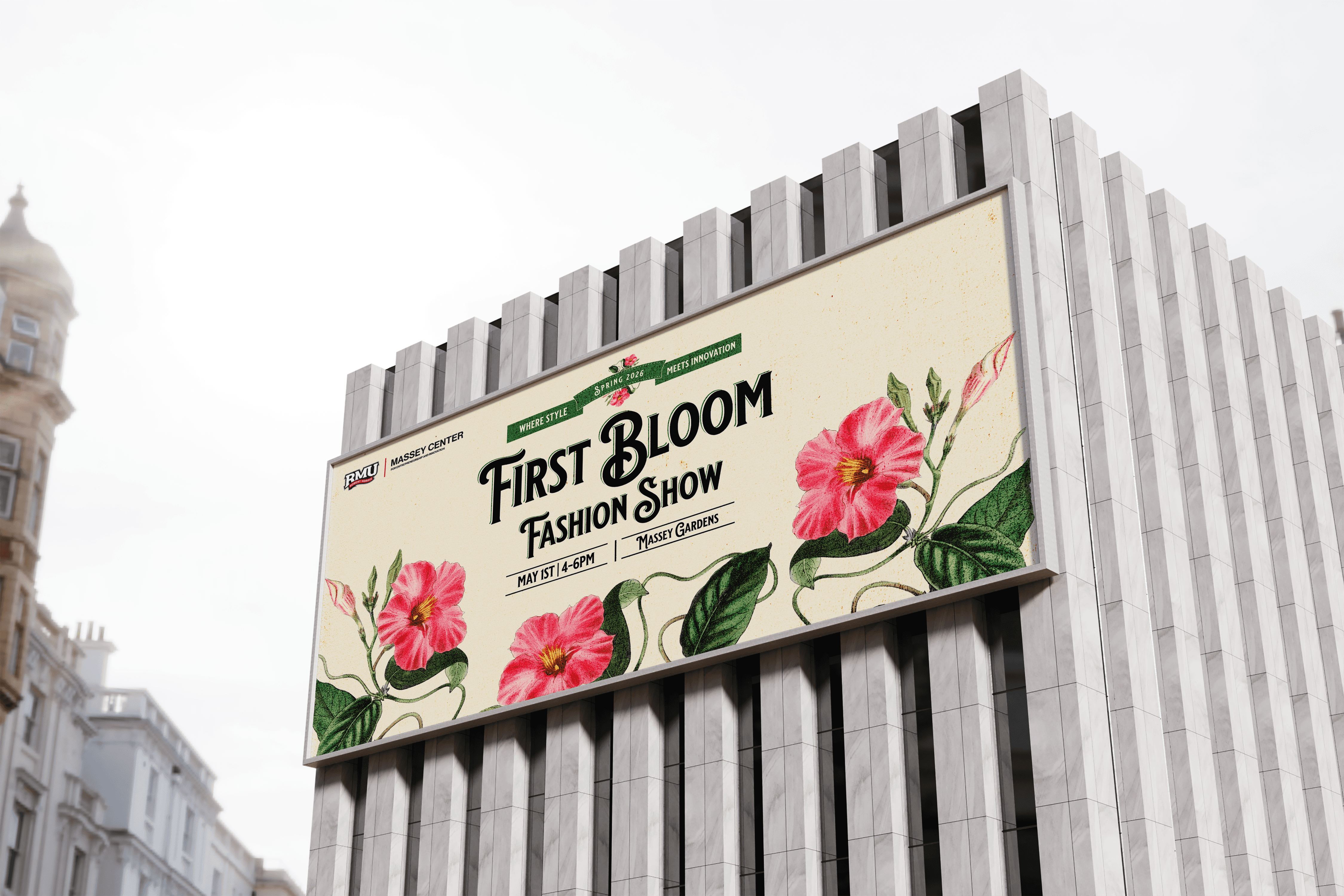
The 2026 First Bloom Fashion Show is an immersive, high-fashion event designed to celebrate renewal, growth, and the breakthrough of emerging design talent. Acting as a seasonal launchpad, the show brings together sustainable textiles, avant-garde floral-infused couture, and cutting-edge runway production. The brand identity and creative direction for First Bloom required a meticulous blend of organic softness and sleek modern minimalism, capturing the exact moment a bud breaks open to reveal something striking and new. This case study encompasses the complete visual architecture, including the event typography, experiential spatial design, digital campaign materials, and physical environmental graphics.
Challenge
The primary challenge of branding First Bloom lay in avoiding clichés. Floral and botanical themes in fashion risk feeling overly traditional, excessively delicate, or dated. The creative team was tasked with redefining "the bloom" for a 2026 audience:
The Conceptual Tension: The identity needed to feel alive and organic while maintaining the razor-sharp, structured sophistication demanded by high-fashion aesthetics.
Experiential Consistency: Translating a kinetic, living theme across vast physical landscapes (the concrete runway, backstage signage) and diverse digital touch points (social media motion graphics, ticketing apps, dynamic broadcast overlays) without watering down the premium tone of the event.
Legibility vs. Artistry: Creating custom event typography that felt fluid and growth-oriented, yet remained highly legible and structurally sound across massive large-format event banners and tiny digital mobile screens.
Approach
To ground the visual system, our approach treated typography and layout like an architectural greenhouse—a rigid framework that allows beautiful, unpredictable organic elements to flourish.
The Visual Language (Dynamic Grid System): We established a juxtaposition between sharp, brutalist grid layouts and fluid, overlapping organic assets. We utilized a sleek, editorial serif for the event typography, modifying its ligatures to subtly mimic the unfurling of petals and stems.
Color Palette: Moving away from soft pastels, we engineered a high-contrast palette. Deep, earthy under-tones (charcoal and muted moss) serve as a foundation to make hyper-saturated, electric botanical hues (acid lime, orchid magenta, and bleeding rose) violently pop, signaling a bold and modern arrival of spring.

Contact Form