Minoru
Industry
Accessories
Client
Minoru
Service
Branding
Date
April 2024
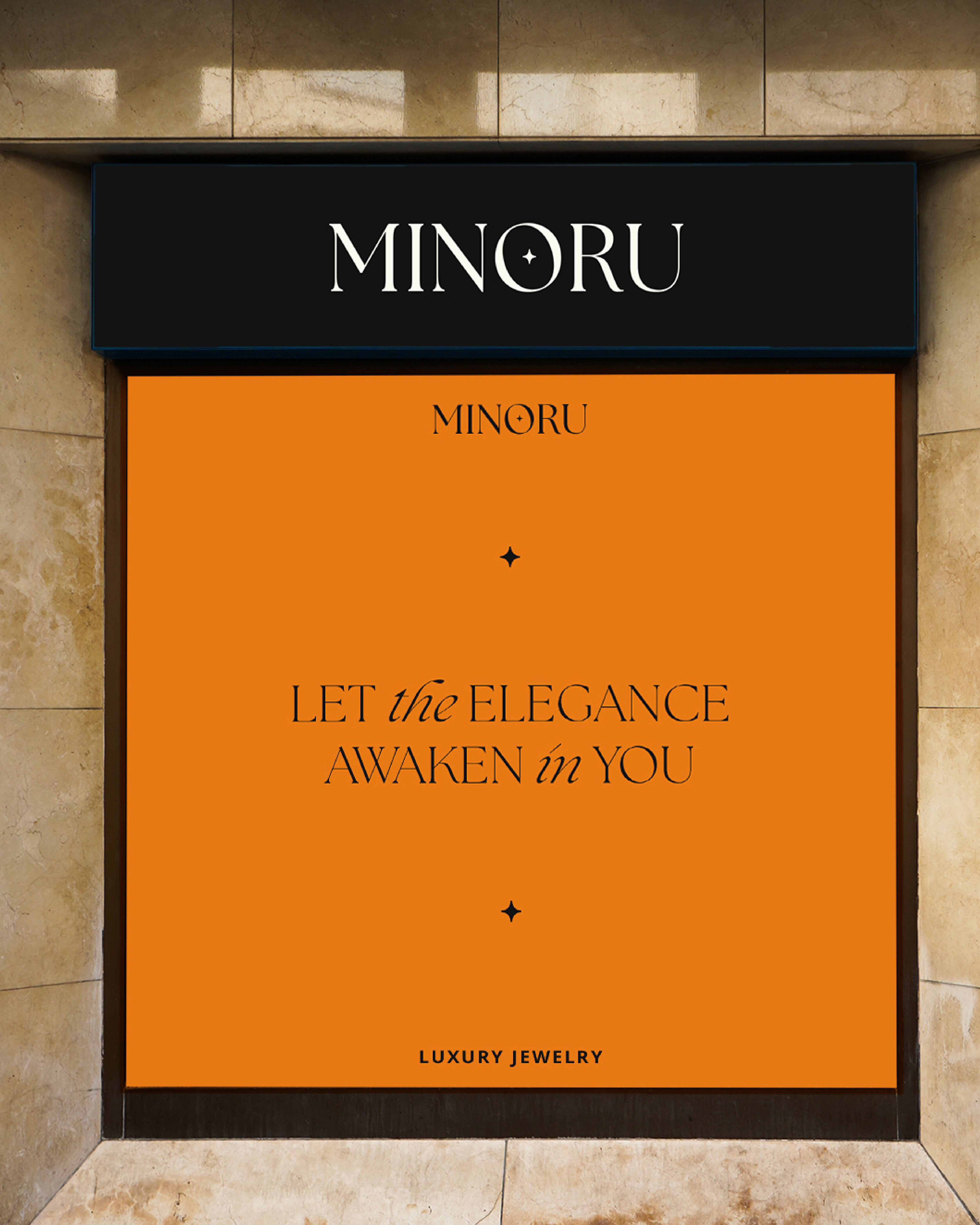
I worked as the Brand Designer for Minoru, a luxury jewelry label that wanted a visual identity that felt refined, modern, and memorable. My goal was to translate the brand idea of “awakened elegance” into a clear system that could live on storefronts, packaging, and digital channels without losing its sense of exclusivity.
I developed a wordmark using a high contrast serif with extended letterforms to give the logo a quiet sense of drama. The star inside the O became the main symbol, echoing the crescent moon icon and reinforcing the idea of precious, luminous pieces. The color palette combines a deep royal purple with a warm amber tone, creating a strong contrast between night and light that mirrors the brand’s focus on sparkle and sophistication.
To make the identity feel consistent, I built a set of layouts and applications. This included storefront signage, branded shopping bags, staff badges, business cards, and a social media look that highlights the jewelry while keeping the brand mark present. I also refined the tagline “Let the elegance awaken in you” and set typographic rules so that headlines, body copy, and logo always feel part of the same family.
Through this work, Minoru now has a cohesive visual language that supports its position as a contemporary luxury jewelry brand and gives the team clear tools to use across print, retail, and digital touchpoints.